COMPETITIONS, INK PALETTES
Autumn Competition Results and Inky Palette
Apr
Seasons change and with this the colours that surround us in our everyday life change along with it. It’s always a magical time if you take a step back, breath in and appreciate the world changing around you. Is this starting to sound like a yoga class?? Oops, what Im trying to get at really is the beautiful change in colour to our everyday scenery and Autumn is one of our favourites for the colours it brings.
As you know, we decided to have a competition to celebrate Autumn’s colours. All you had to do to enter was send us a photo of your South African Autumn.
It has been so much fun receiving your Autumn photos from all over South Africa. What a beautifully country we live in!
And well then the fun came to an end when we had to choose a winner. Which sounds like fun but it also means that we had to pick only one from all the entries! A difficult task even for the Simon Cowell’s of this world.
The reason why we chose this photo is that it seemed to capture the uniqueness of a South African Autumn. To me that is that the beautiful rich greens remain while the browns, oranges and reds start to peep through. This is very generalised though. We have every shade of Autumn you get here in SA. In fact if you are towards the coast of KZN you just have rich greens with almost no Oranges and Reds.
Congratulations to Richard for sending through the winning photo.
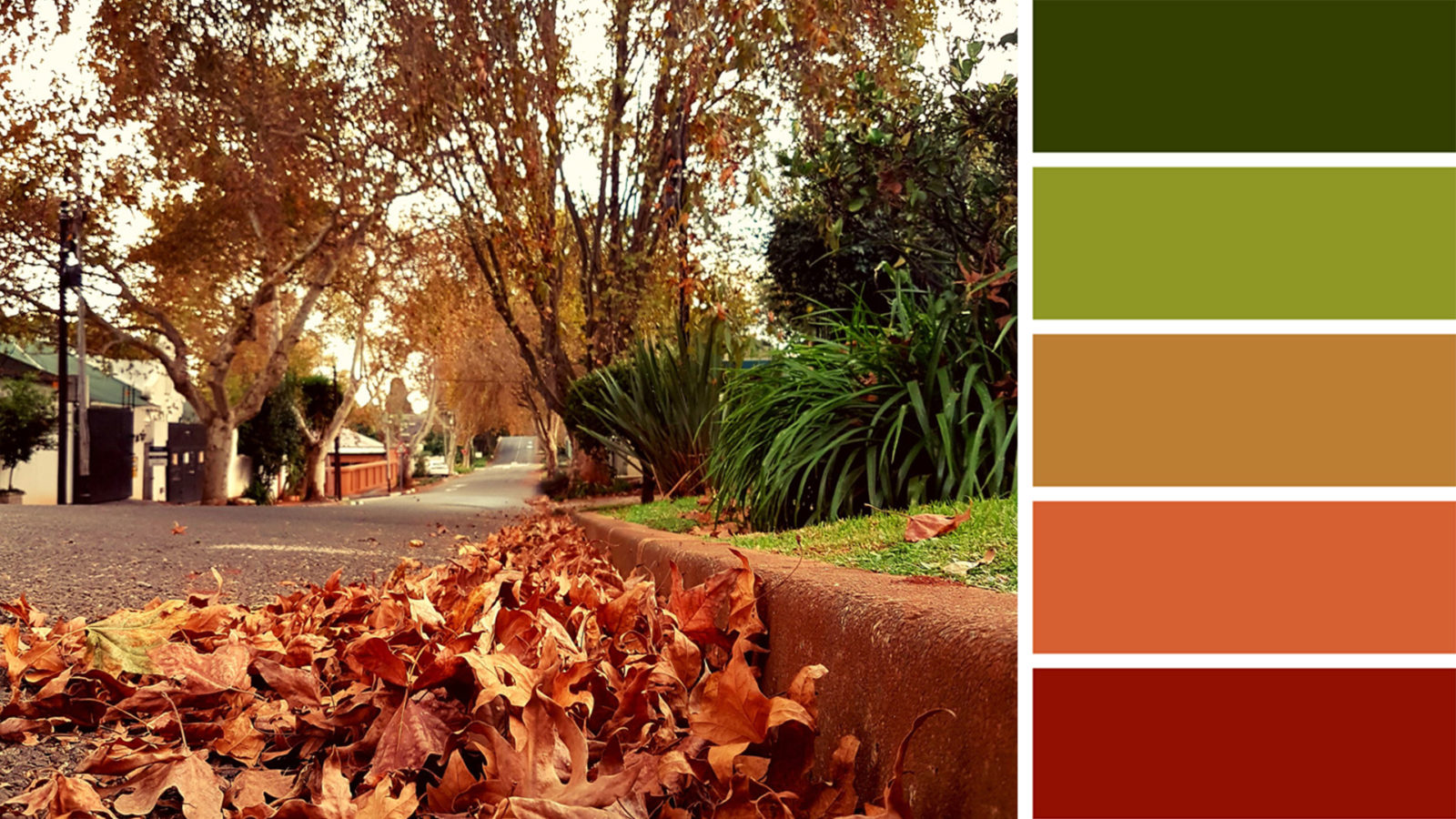
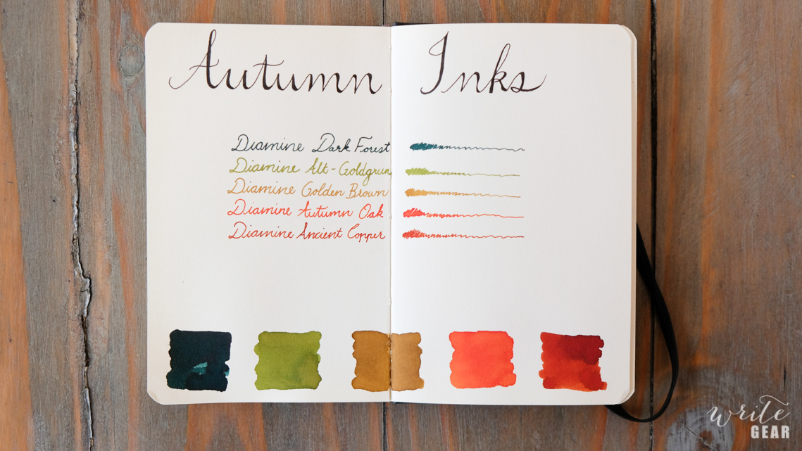
We’ve chosen five ink colours (a palette of sorts) that corresponds to the different colours in Richard’s photo:
Rohrer and Klingner Alt-Goldgrun
Yes I know there is a lot of Diamine inks there but they just have the widest range of colours to choose from. If you are looking for a specific colour then the chances are that Diamine will have it.
That was meant to be the end of this blog post but then we thought maybe we give a quick run down of each of these colours for those of you who may not have tried some of them yet.
Diamine Dark Forest – The is a great deep dark green with all the amazing properties we have come to expect from the Diamine 150th Anniversary range. The colour is saturated and dark but not dark enough to be a green black. This ink was chosen to represent the deep dark green shrubbery and plants you will find around this time of year.
Rohrer and Klingner Alt-Goldgrun – This is ofcours a pretty famous ink. Known for its great amount of shading and its unique colour. This one has been chosen because it just seems to capture the shades of green seen in Autumn. This is one of those classic inks that anyone who loves shading should own.
Diamine Golden Brown – Another great shading ink. Quite a light brown that does seem to hint at being golden. This ink represents the golden brown seen in the trees.
Diamine Autumn Oak – The Diamine ink that is known for its shading. It shades through a range of different oranges. The name says it all! This is a mute orange ink that seems to capture the shades of oranges seen in the dying leaves of Autumn.
Diamine Ancient Copper – Diamine’s best selling ink ever. A deep rich saturated orange that captures the deep dark orange browns of autumn. An ink that every ink lover should own!

There we have it. An ink colour palatte to get your pens set for Autumn. Most of the inks come with great shading and since the autumn outdoors are filled with lots of shades of colours it seems apt.
And a final cherry for those that have read this far. For the rest of April we are giving you 10% off any of the above inks. (Discount applies when you put the ink in your cart). This is your opportunity to try out a new ink for this new season. 🙂