
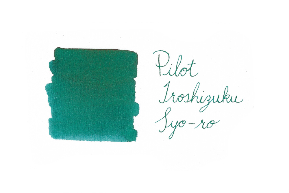
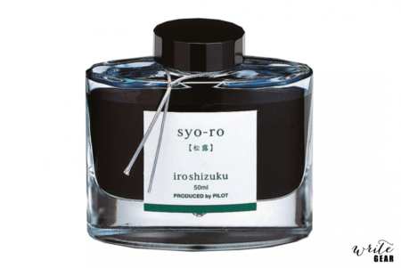

Pilot Iroshizuku Ink Bottle – Syo-Ro
R50.00 – R580.00
Details:
Pilot Iroshizuku Fountain Pen Ink Bottle – Syo-ro
Colour: Dark Turquoise
Volume: 50ml
Bottle Material: Glass
Suitable for use in all Fountain Pens.
Syo-ro
The name Iroshizuku is a combination of the Japanese words Iro (Coloring), expressing high standards and variation of colors, and Shizuku (Droplet), that embodies the very image of dripping water. Each ink name derives from the expressions of beautiful Japanese natural landscapes and plants, all of which contribute to the depth of each individual hue.

syo-ro Dew on Pine Tree (Dark Turquoise)
The color of pine is the most representative of Japan’s evergreens and has long been celebrated as symbolizing eternal permanence. This shade of green conjures a dewdrop reflecting the pine needles.
| Weight | N/A |
|---|---|
| Dimensions | N/A |
| Bottle Size | |
| Colour | |
| Ink Format | |
| Ink Properties | Standard |
Brand
Pilot
2 reviews for Pilot Iroshizuku Ink Bottle – Syo-Ro
Add a review
Related products
Fountain Pen Inks

Fountain Pen Inks
Fountain Pen Inks
Fountain Pen Inks
Fountain Pen Inks
John Roff (verified owner) –
If I could give six stars, they would go to this liquid masterpiece. I used to think ‘ink is ink, right?’ ‘Wrong.’ To start with, all the Iroshizuku inks are really well crafted and flow beautifully, enhancing the performance of whatever pen they are in. They definitely improve the sensory experience of writing. This particular ink is the first expensive one that I have considered buying a whole bottle of, after trying a sample. The colour is extraordinary, shifting from a deep blue to a mysterious green as it dries. It’s almost as though the ink has a life of its own. I feel peaceful and alive all at once when seeing the ink colour on a page.
My usual thought with fountain pens is ‘which ink will enhance my experience of using this pen?’. With this ink, my thought becomes ‘which pen will best enhance my experience with this ink?’ The Kaweko Perkeo in Old Chambray is the current favourite. I will try a Parker Cisele with a broad 14ct gold nib next.
It’s my birthday in October. Just saying…
primitive.ziets (verified owner) –
This is one of the more fountain pen friendly inks in my collection. The ink flows quite smoothly, making for a comfortable writing experience. This shade writes blue, then dries to an attractive teal. This shade of ink works well on ivory-coloured paper. The teal is an enigmatic colour reminding one of the wet pine needles that it was named after.